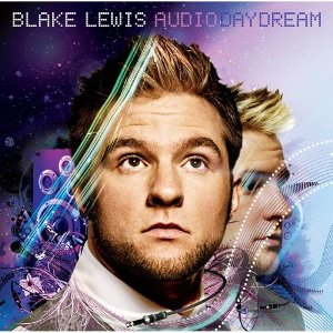
ETA: The Blake Lewis album cover has been posted at Amazon. Here it is…
Trippy!
From the folks at Team Plaid…
An update on what’s up with Blake Lewis…
Blake has invited some of his fellow Seattle musicians to help out in the studio. His friends from the Panda Conspiracy will fly to LA tomorrow to start filming Blake’s video. They also recorded the horn parts for the single “Break Anotha’” in Seattle last month with producer Ryan Tedder:
Last week I got a call from Blake while I was walking threw isles of excess at Costco. . Supprised to hear his voice he said “Hey, you & TJ want to come down to LA to be in the music video and do an appearance on Leno and maybe some other gigs?”
Bottom Line: Friday seems like it’s a GO to fly down and be on the video. It’s a little heart wrenching with all this back and forth mumbo jumbo especially because we had to make the decision to back out of a few gigs in order to be there including Olympia with Flowmotion this Friday. . But there you go.. .
From another collaborator, Kent Halvorsen:
Los Angeles with Blake Lewis
We had the most magical day yesterday. first of all, we recorded at Jim Henson studios. That’s right the original lot where the muppets were made! We recorded the intro, outro, and transitions for the album and it was magical. I can’t wait to hear it mixed and mastered.
Related Posts


WooHooo happy for TJ
I can’t wait to see this video! I bet it will be HOT just like Blake’s single.
I am also very happy that Blake is climbing up the charts in mediabase with only one week after his single release.
Go Blake!
Do you have a link to the mediabase chart maracaibo?
I heard his song on XM radio yesterday. I was shocked because it normally takes a while until I hear AI songs. So catchy!
Yes I do ealbino. He is #74 on the pop charts (top 40 stations) after one just one week of his single being released.
You can take a look here.
http://w2.mediabase.com/mmrweb/AllAccess/Charts.asp?format=h1r&showtopn=500&cutoff=1
Thanks maracaibo! :-)
Hmmm. Well, I like the design well enough, but blank expressions devoid of personality must be the norm on album covers these days. Not the pic of Blake that I would have chosen. He looks way too somber for the music I’m expecting.
Mmm. I like the artwork but that is a very unflattering picture of Blake. That’s the best picture of him they could get?
My reaction exactly - why the blank stare????
The design fits, but Blake looks so….confused. It seems very much to be an “Oh look, aliens are landing” stare.
Hmmm….it strikes me as being very 70s. I thought they were aiming for the 80s? Between the font which looks like it is straight of Pong (or the Amdahl 370) and the 70s Sci-fi movie poster artwork, I’m reminded of the days of yore. But, hey, 70s retro is in…look at how well The Eagles sold.
Not the most flattering pictures of Blake (where is the spark of mischief in his eyes?), but as PJ pointed out, the stunned zombie look appears to be in these days. Kind of fits with the 70s sci-fi artwork. Maybe it’s kind of an editorial comment. Clive has a 70s mindset and turned Blake into a zombie who must do his bidding. The cable that is floating in front of his neck will soon be inserted into his head and he will continue his borg-like existence. But, like all enslaved humans in sci-fi movies, he will fight his evil master and overthrow him?!?!?!?!?!?!?!
Ahem. At least the album cover will definitely stand out on the old record store rack and that is what counts. Catching the eye of the customer is half the battle. It’s funky and different with at least a little imagination, so I applaud the cover.
I actually really like it.
This is the most unique and COOL cover I’ve ever seen from any Idol.
I also think that Blake’s picture perfectly represents what the album title is all about. “Audio Daydream”. Nice.
It will definitely capture the public attention.
Way to go Blake!
It’s not the disaster that Kat’s cover was. That was the tip off that they didn’t know what to do with her. But it won’t add much. Blake should have appeal for the tweens but the cover makes him look fat and unattractive. If the music is good the cover won’t matter but they could have picked a better picture.
He doesn’t look fat! What are you talking about? He looks pretty good to me, to each his own I guess.
The artwork is really nice and interesting, but yeah that’s an unflattering picture. I don’t necessarily think he looks fat but rather too full in the face. The angle is weird. It will probably be very eyecatching though on endcaps.
What is this “record store” you speak of?
I never really pay attention to what the CD cover looks like. I couldn’t tell you right now what Daughtry’s looks like, I can’t remember what Carrie’s last one looks like. With that being said, this one does stand out. “Trippy” has MJ says. The picture is fine, not the best I have seen of him, but okay. So yeah, cool CD cover.
My initial impression of the cover was…It is not the “typical” Idol cover graphically, it shows a bit of creativity. Additionally, the expressionless face and eyes devoid of life, for me, capture the essence of Blake, perfectly.
Record stores in Canada must be very different from those in the U.S. LOL
You know! “Records” The things that replaced Victrolas.
They are. Trust me. The pink/purple will stand out well against the white of the snow. All our record stores are really just oversized igloos.
But, with the near constant driving snow storms, all Canucks are snow blind. Thus™, no one will actually be able to see the pink/purple CD cover—or much else, for that matter.
LOL. Maybe they are setting up the Season 6 answer to “From Justin to Kelly.” That obviously didn’t work, so this time they cast Blake as a little mad scientist who turns his “friend” Jordin into a virginal teen by day/Amazon killing machine by night. She actually realizes that Blake has been programmed by Clive during one of her home schooling sessions and manages to save then both, killing Clive and freeing all former Idols in the process.
Then, Jordin and Blake giggle. The End.
Excellent! Now you are thinking. Nigel would be proud. We could call it “The Lewis and Sparks Expidition - A Voyage of Discovery!”
[I think I just made myself barf]
Don’t be silly. Canucks have evolved such that we no longer rely on the optical range. We can see infa-red. Trust me, there is all kinds of heat coming off Blake’s album (or maybe that’s off the Blaker Girls. It’s tough to tell when one is snow blind).
[oops, there I go again]
I agree that that is not the most flattering picture of Blake (I don’t like the facial hair - he looks like hobo with hair gel). I think it would be OK if his head weren’t so….gigantic. This disembodied head in the background looks OK, maybe the giant head is his evil twin and the real Blake is trapped in the pastel swirly things?
Oh well, at least he didn’t call his album “Taylor Hicks” or “*** *******”
The whole purple/pink thing does give me flashbacks.
http://youtube.com/watch?v=DX-rLn14g04
I actually like the background picture better than the one in the front, but surely there could have been better ones.
The cover as a whole is “eh” for me… The design and artwork are good, as pj said, but the picture doesn’t capture his personality - at least the personality that I’VE seen on the show and when I’ve met him - at all. Oh well. I’m not expecting to like everything.
I think the blank stare was meant to capture the whole A.D.D thing. However, this is definitely not the most flattering picture of Blake. He (or his management) should keep in mind that looks sell.
Hey, what’s wrong with purple(/pink)? LOL
Well, at least the big Blake does look like he’s daydreaming…about nothing.
I also think the small Blake is nice, though. :)
That’s the point! Of course Blake has taken tons of better pics than this one, but I think it goes with the theme and it will standout in the crowd.
Personally I really like the album cover
Mostly because of the creative design and art work
I also like the idea of a second face of blake in the background
Really hated the cover pic at first but now I’m starting to like it more because it fits the title of the album “AudioDayDream” so I’m cool with it
Anyway I can’t wait for this album to come out!
That shot makes him look fat. I get the blank stare but the pink purple scheme just looks really cheap and corny.
People may mistake it for a Doctor Who or Star Trek CD which could boost sales.
ooooh.. Nice album cover.. different, colorful, eyepopping…and I like both pics of Blake..he’s daydreaming in the first and cutie looking in the background one.. Can’t wait for his album!!
I like the color and think the cover art is very cool but don’t like the pic of Blake (agree with Sarah about the 2nd pic). I just don’t think it’s the most flattering and it doesn’t show his personality that I loved on the show.
A comment on another site likened this pic to C. Evertte Koop; a much, much younger version obviously. Hilarious, and sadly, true.
I do think the song is catchy. I just wish he had released the Chris Rich collaboration first.
Den, do we know if the Chris Rich collaboration made the album?
Oh, I was assuming it did. It didn’t even cross my mind that it may have not. Hoping and praying.